Making Our Kitchen Inspiring with Sherwin-Williams
This post was sponsored by Sherwin-Williams®. All opinions are my own.
If you know anything about us East Coasters, then you’ve probably heard about our Epic kitchen parties. There's just something about the kitchen to us that screams comfort and family. A classic Nova Scotian home has a back door leading straight into the kitchen that family is always welcome to enter in and out. With our home, the kitchen was the first room we walked into when we came to look at it with our real estate agent. It was full of memorabilia that reminded me of my grandmother and an overall feeling of being home.
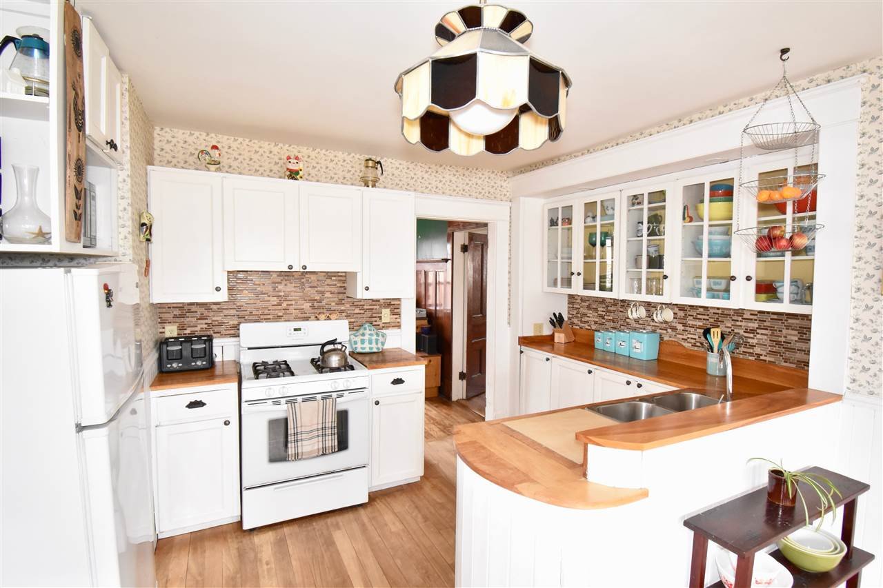
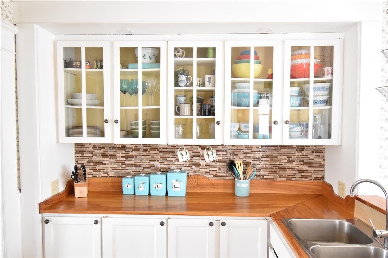
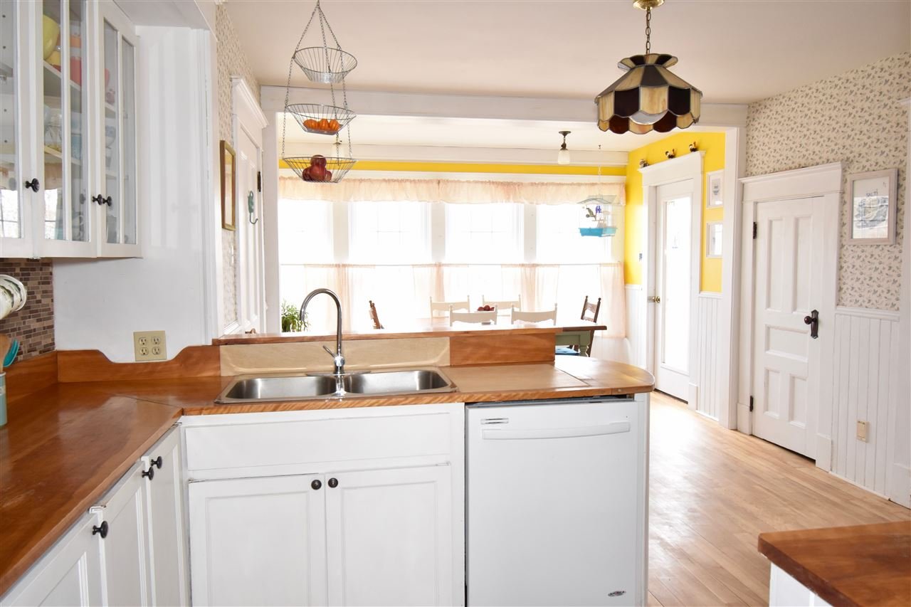
After 3 years of living in this home, we have done multiple mini makeovers to the space, using the new skills we are learning along the journey and trying to improve spots we've noticed along the way. As much as we would love to fully gut and change the layout, that's not really an option in this house currently. So, if you've been following us over the last 6 months, we have been trying to make this kitchen as best as it can be in the current footprint.
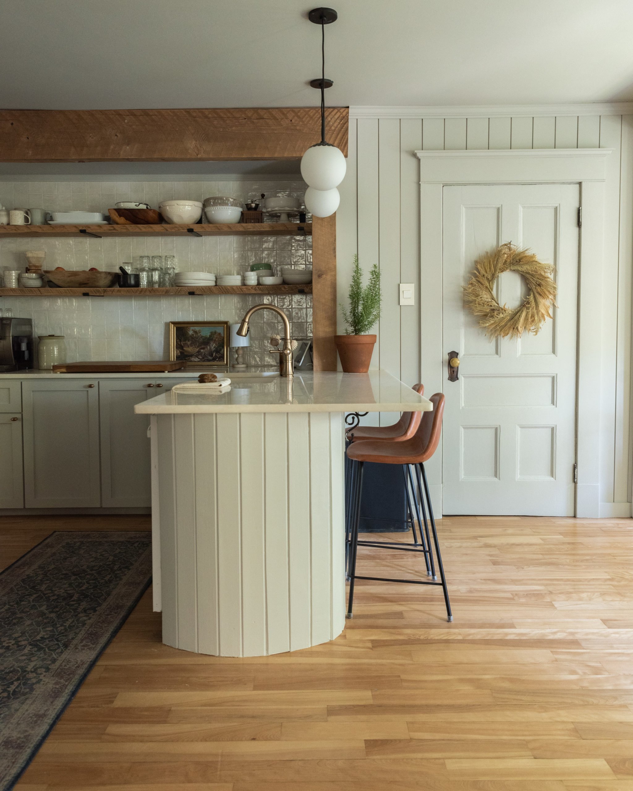
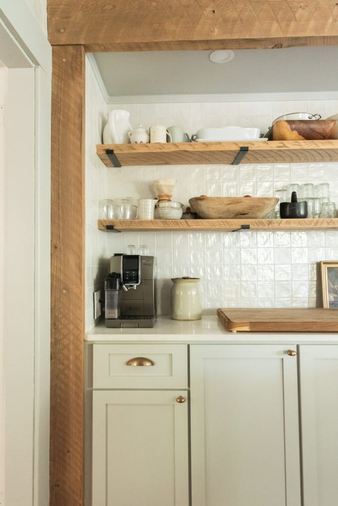
We've been taking you through the entire process of this kitchen redo on this blog. As you've seen in previous blogs, we have ripped out the walls, removed the plaster and lath, rebuilt the walls with vertical shiplap, waited for months for the perfect tile and now with the power of paint, we are tying in all that work together.
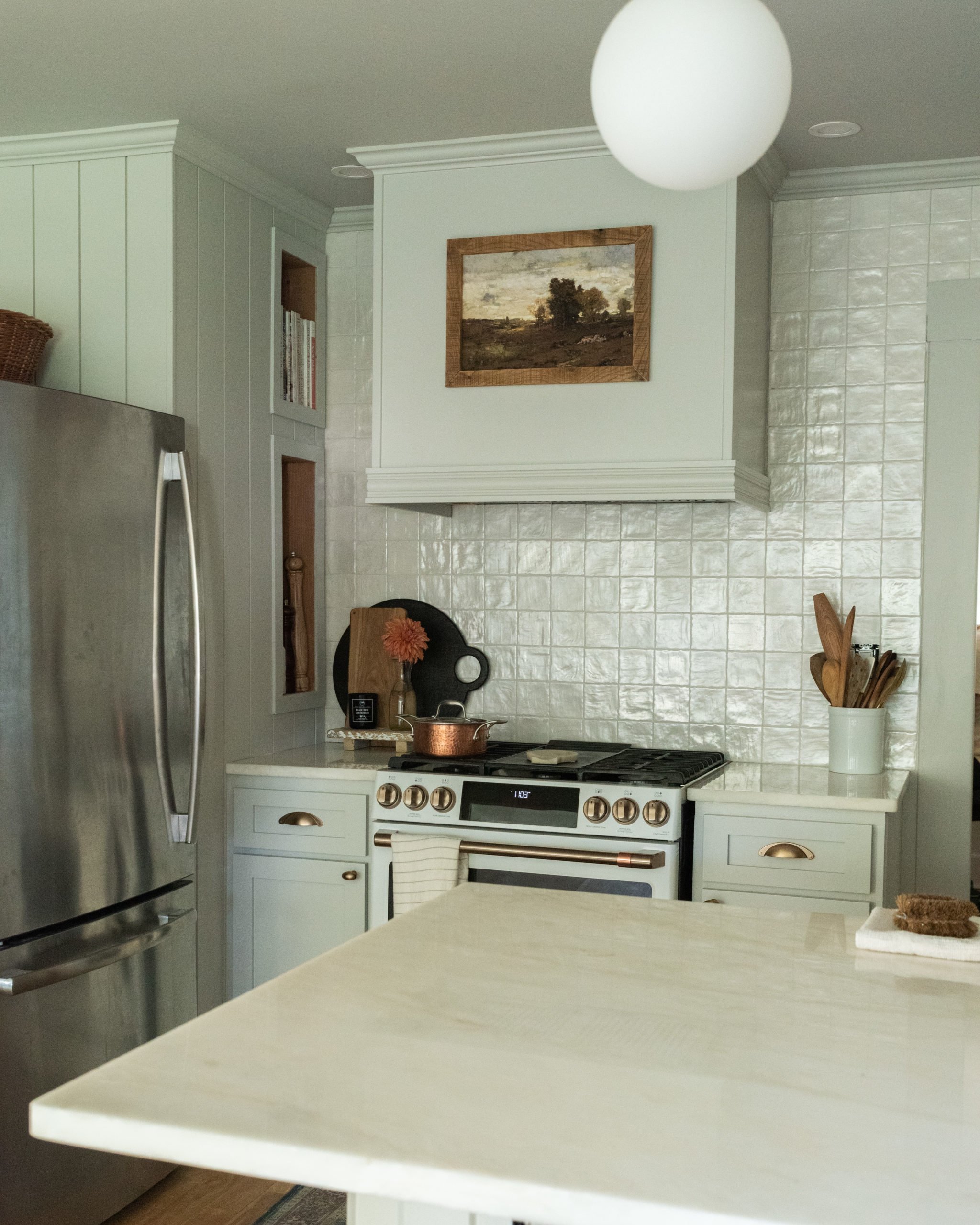
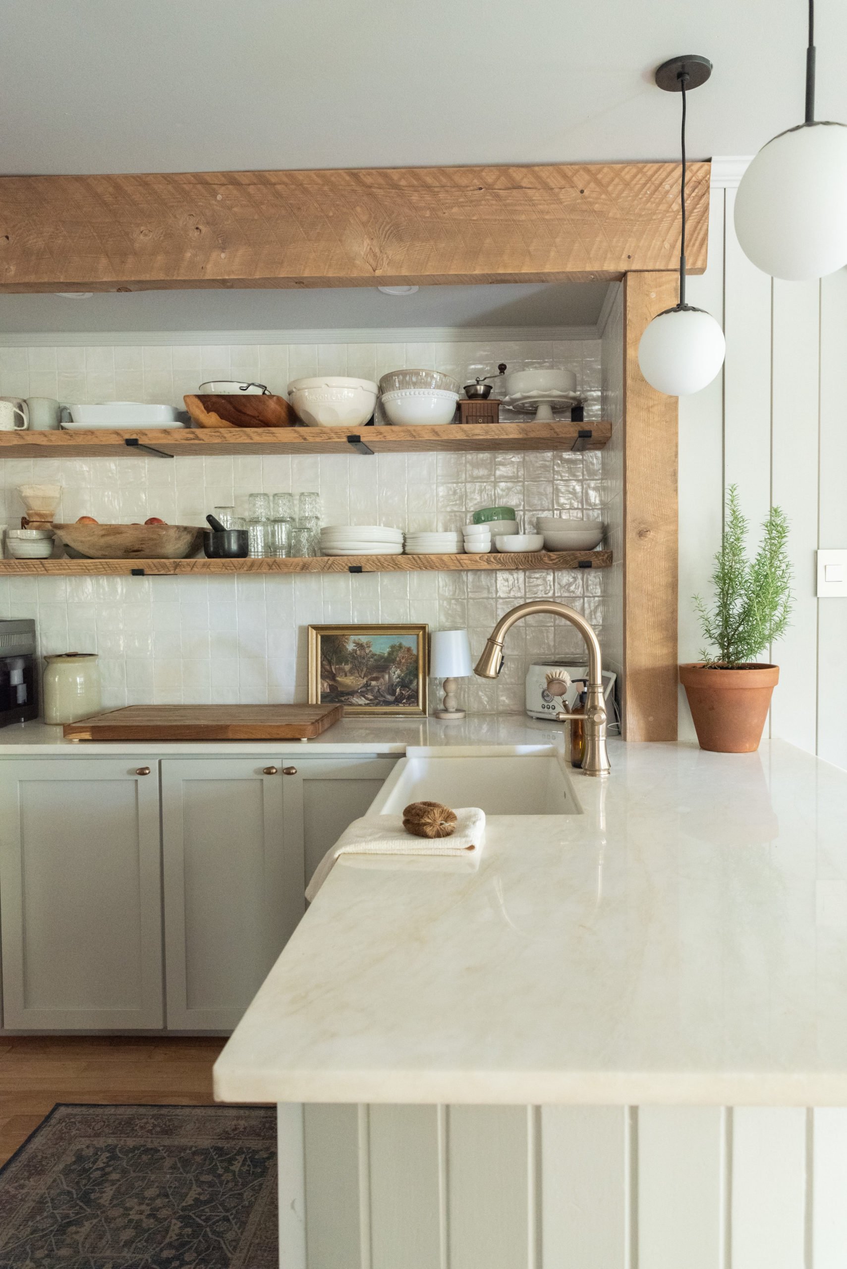
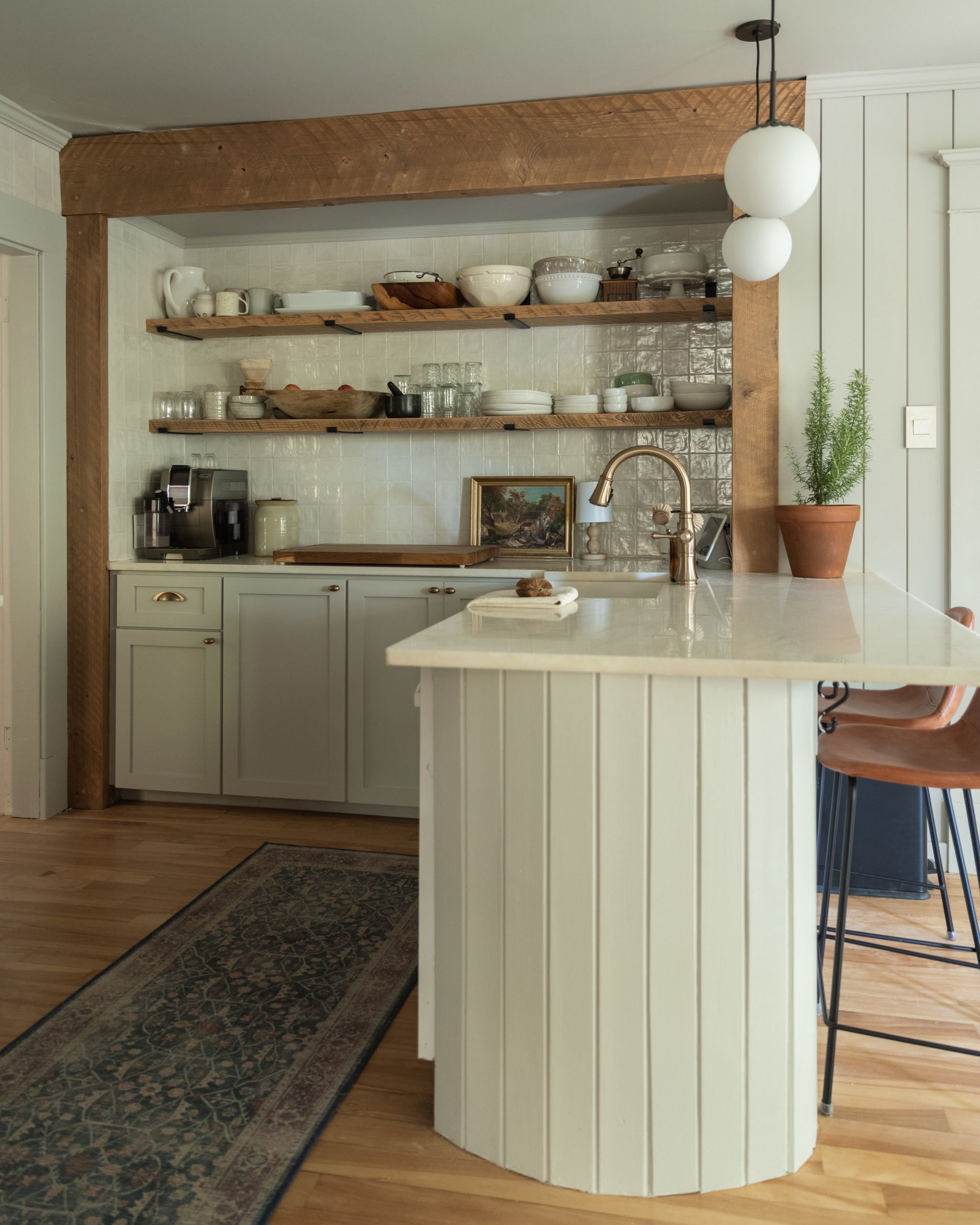
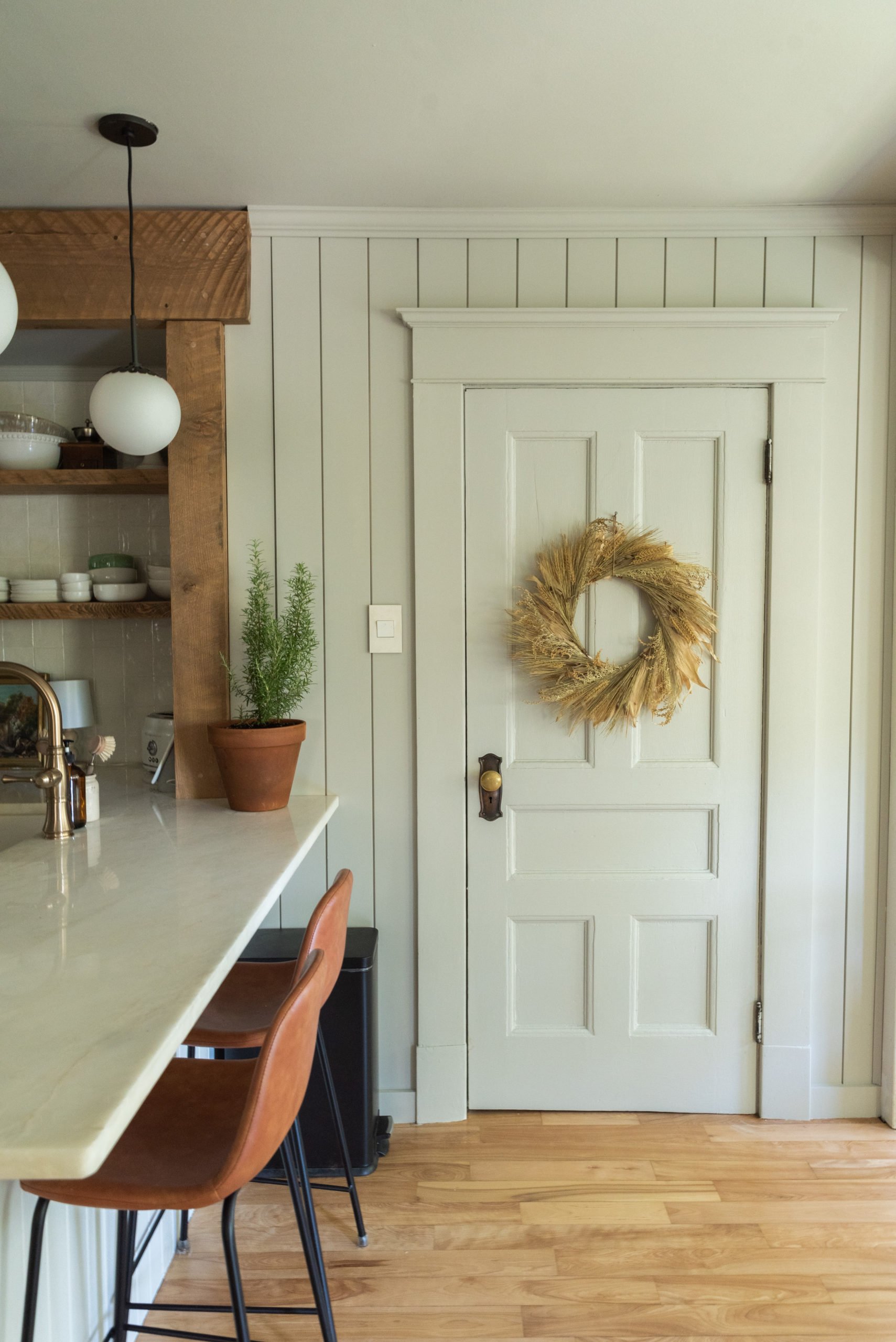
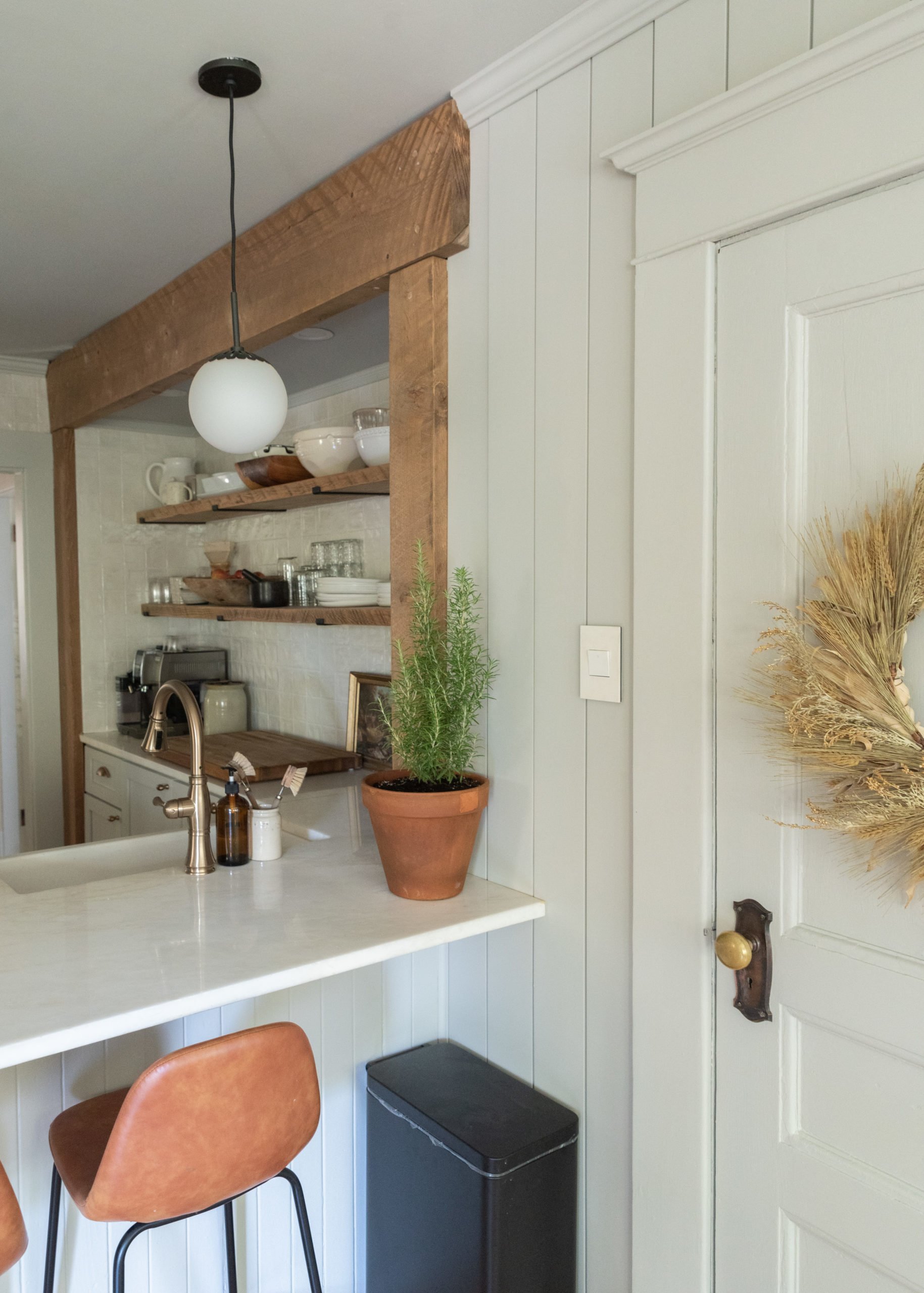
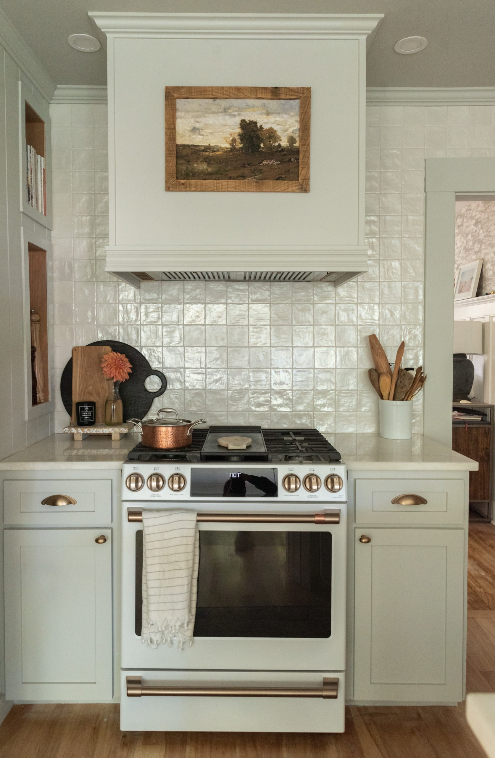
We've teamed up with Sherwin-Williams, using their Living WellTM Collection to find the perfect color for our Century home. The Collection itself is comprised of 11 palettes to create the atmosphere that you desire for your space. For us, being inspired in our kitchen was a feeling we wanted to have. Not only being inspired when it comes to our cooking, but this multipurpose space in our home is also used as an office, a craft room, and a bonding place for our family. We chose Repose Gray SW 7015 from the Inspire palette, which is full of feel-good brights.
Repose Gray is the perfect neutral light gray that not only compliments the rest of the greys in our home, but also pairs perfectly with any decor we throw at it. We can't be the only ones who think of the holidays when it comes to choosing a perfect color. There's a lot of decor that comes up and down on these walls depending on the holiday, and we wanted something beautiful and neutral, but also timeless to match our Century home. I think we found the perfect balance.
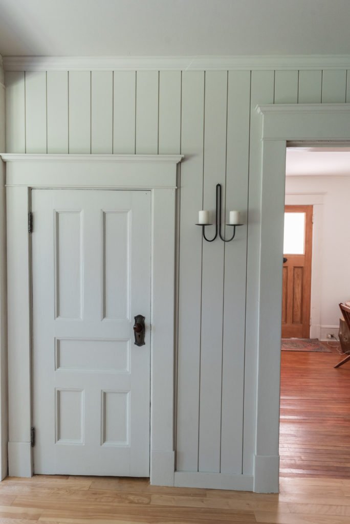
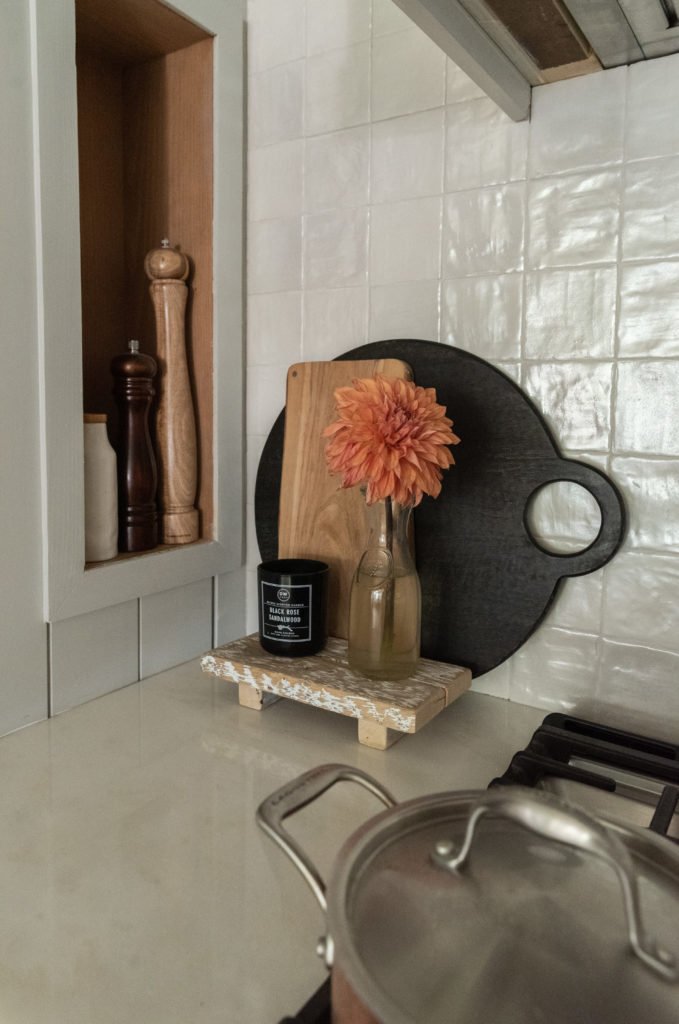
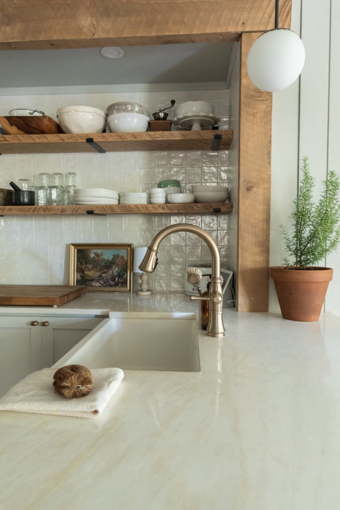
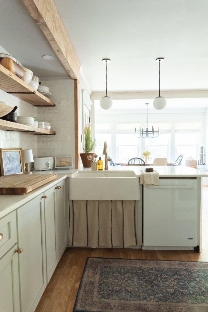
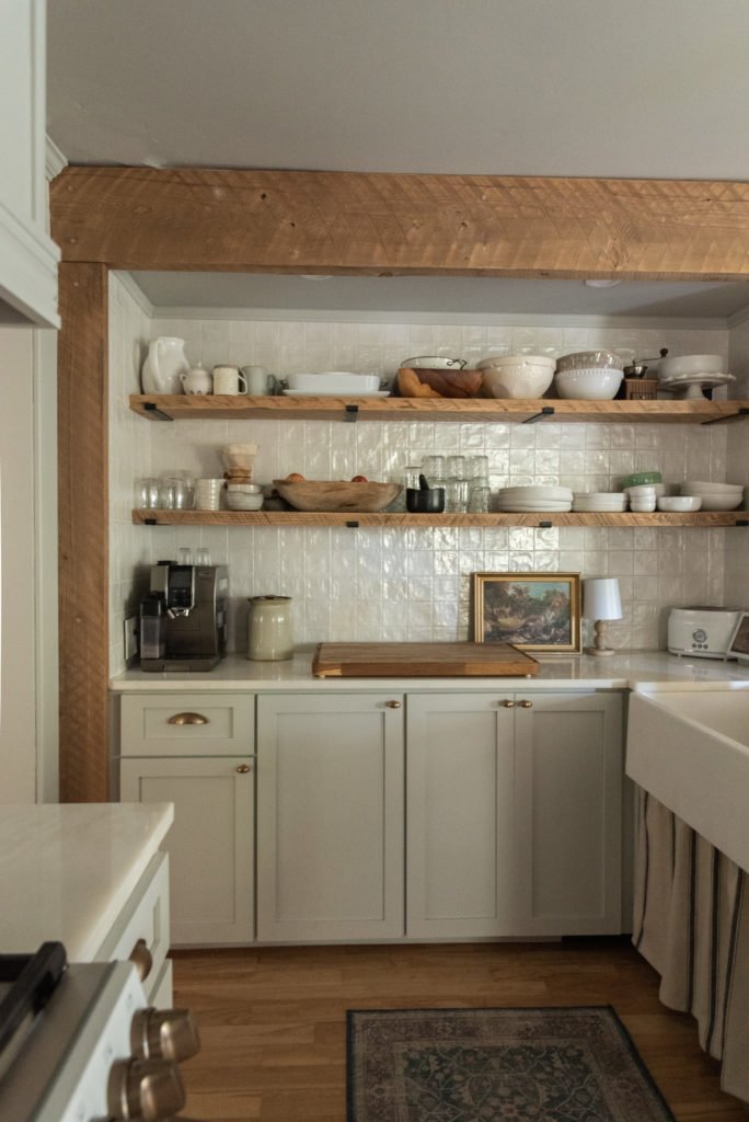
To make sure we really packed a punch and tied in what we've been doing with other rooms in our home, we went completely monochrome with the paint in our kitchen. That means every surface that wasn't tile or countertop was painted with Sherwin-Williams SuperPaint® with Air Purifying Technology. This very durable, zero-VOC paint has technology that helps reduce VOCs from potential sources like cabinets and fabrics. It also has odor eliminating technology that breaks down unwanted household odors. Perfect in a space where you're constantly cooking with strong smelling foods.
We couldn't be happier with the paint process and the color that came out of it. With only two coats, we were able to efficiently paint our kitchen and our new cabinet fronts with a professional finish.
What do you think of our new kitchen?
